Monday, 4 April 2011

Evaluation Continued...

What have you learned from your audience feedback?


When gathering feedback from an audience we decided to have a relaxed forum where people of varies ages approached us with there useful and overall positive opinions. As you can see from the key words raised on 'wordle' I found that the most prominent thing about our video was the natural surroundings that we filmed in. This surprised me and my group because we thought that people would more than likely simply comment on the narrative and didn't think nature would be brought up in the discussion. I noticed that it was more the older viewers that picked up on the setting that we filmed in, using words such as 'beautiful' and 'moving' to describe it. This made me feel proud, as my group had worked hard at finding the perfect location that would capture the themes and story within the lyrics of the song. If i ever had the opportunity to repeat this project, i feel like more time in setting the camera up to get the perfect shot would have showed off the beauty of the location, however overall i am pleased with the outcome of our video.


The comment that I liked the most was that it looked like a real and modern video that you would see on typical music channels such as MTV. Seen as this was the aim of the whole project i really gained a sense of fulfilment and felt like the hard work put in by my group really paid off. The person who gave us this feedback continued to say that the 'simplicity' of our black and white shots was extremely interesting and was his favourite part of the video. This feedback was very helpful because it made me think that you don't have to have high tech equipment or fancy lighting, sometimes the simple shots and ideas work best. This feedback is one i will remember in the future when approaching other projects.


We also showed our tour posters and CD covers to a group of teenagers as we wanted feedback from our target audience on our ancillary texts. We showed these to the group before our video and recieved very useful feedback, mainly saying that our products looked like real modern CD covers and tour posters.


How did you use media technologies in the construction and research, planning and evaluation stages? (YouTube, Photoshop, Premiere Elements)

In the planning stages of our music video we decided to design detailed story boards to help us plan each shot and to help us gather all our ideas together. Through the process of our music video project our ideas changed, however we did eventually refer back to our story boards and continue on with our original ideas. It was due to our thorough storyboards that my group was able to get back on track and made sure we was able to present a clear narrative to our music video. Early planning was a massive help in the process of finishing our final video and ancillary texts, for our ancillary texts we created rough drafts ideas, including the logo, colour scheme and what photographs we were looking to take.


During the process of creating our final ancillary texts we decided to use Photoshop as this would give our CD covers and tour posters a professional and modern edge. Also by using Photoshop to edit our work we were able to use filter adjustments to change the lighting that we couldn’t create on camera. We layered the image of Lucy onto a white background and then used the magnetic lasso to cut images of birds from their background, we then used select and the paint tool to recolour the birds from black to red. By recolouring the birds to red we thought this created a very controversial image as birds are usually associated with colours such as white which connotes peace, however the colour red suggest power, danger and sexuality. This could suggest that ‘Bella Diem’ is breaking the rules of the music industry and challenging traditional ideals. We emphasized this idea by using enhancements in the filter menu to posterise the image of Lucy which gives the image more depth and the shadows created creates a sombre effect. Also by using posterize I feel we have emphasized Lucy’s dominance and power within the band and having her as our main image on all of our ancillary texts emphasizes that the music is all about her.

For fonts we used www.dafont.com/, we decided as a group to use an italic font which would represent a signature, giving the album a personal touch for the audience. We had to copy paste and fill in the chosen colour through Photoshop select each letter individually, this took up a lot of time but we didn't want to use a font already on Photoshop that would look like something off Microsoft Word. Even though this was extremely time consuming I genuinely feel that by using Dafont.com our ancillary texts such as our tour poster ended up looking professional, modern and very attractive to passers by that would see this tour poster on billboards.

When researching for our music video we used www.youtube.com and several other music channels in order to gain ideas and get used to the codes and conventions of popular, modern day music videos. We mainly watched and analysed artists of the acoustic genre including Jason Mraz, Laura Marling and Regina Spektor. These famous acoustic artists showed us what common features we should include in our music video e.g. the use of nature, and the idea that the artist is at one with it. Whilst watching these I annotated 3 different videos from YouTube and annotated album covers and Digipaks from Google. This I feel was a helpful process as it not only gave me many creative ideas but it also showed me what interests me in a music video and what emotions i should expect to feel after viewing it. The covers showed me what it is that attracts people to listen and buy them, and also what sort of symbols I should use in order to create deeper meanings and connotations.


When constructing our music video we used several different media technologies in order to make sure that it was finished to a professional standard and looked like a modern music video. To film our music video we used a Panasonic SDR S26 camera, even though we found it extremely easy to use... It would have been useful if it had contained a light as this limited us to only filming in the day. As we filmed most of our video in winter we felt extremely limited for time. However, with the video now completely finished I don’t believe that it would have looked any more effective with the darker night shots as the brightness of our shots emphasize that the lover’s relationship in the video was happy and full of romance. We also used a tripod for steady shooting and different camera angles and movements and to save all of our filming we had a 4GB Memory Card.


We began to use Premiere Elements for editing the video but struggled with the formatting, each lesson technology let us down so we eventually decided that I, at home would use Windows Live movie Maker to edit the video shots and put our video together. I used Wondershare for converting files to allow them to be saved to a hard drive and uploaded to blog.

Sunday, 3 April 2011

Evaluation Q1 & Q2

In what ways does your media product use, develop or challenge forms and conventions of real media products?
From the beginning of our music video project it has been an aim for my group that even though we want our music video to look real, we wanted to challenge the codes and conventions of typical music videos and put our own mark in the music industry.
In the planning and researching stages for our music video we decided to watch music videos of the acoustic genre in order to gain an insight into the codes and conventions. The most influential artist in the development of our own music video was Adele. The video to ‘rolling in the deep’ inspired us to use a black and white filter as when we analysed this video we felt that it was this effect that emphasized the emotions of the song lyrics. I also became aware of how the simple shots of Adele sitting on the stool in the middle of a room made the audience attentive to the themes in the lyrics, as it highlighted that Adele felt alone and the image of her isolated in the room emphasized this. The themes within this song were the same in ‘bullet’, this lead to us using and developing the idea of the artist being sat down singing the lyrics. I found that when watching ‘rolling in the deep’ there were a lot of long shots and mid close-ups and thought that there should be more close ups as this focus on the face would show the artists emotions. This criticism helped us when filming as we decided we would put emphasis on different facial features-mainly the mouth and eyes. This was exceptionally effective as it made the performance more interesting and enjoyable to watch but also made the audience connect with what the artist was singing.
 Other music videos such as Jason Mraz’s ‘I’m yours’ and Laura Marling’s ‘New Romantic’ used close-ups and extreme close-ups often which was very successful this inspired us in our performance shots to focus on the mouth singing the lyrics and the eyes to show the pure emotion behind the lyrics. One of the ways we challenged other music videos is quite subtle but had a phenomenal result. When editing the narrative to the music video we decided to use a high brightness to suggest that the memories of the female lover are happy and beautiful however the performance shots are black and white. The contrasts between the shots are a great success, I feel that this decision will help the audience engage in how the female character is feeling and they will be able to relate to her emotions. besides this, the contrast between the shots are beautiful to watch as it makes the narrative clear as it shows an obvious difference between the past and present within the video. The theme of memories is a key theme within music videos such as ‘photograph’ by nickelback. This video uses quick montages of special moments. We decided to use this technique within our own music video as we felt in ‘photograph’ this technique was extremely effective in portraying the theme of lost love and wanted the same effect in our own video.

The themes within our music video are very conventional as our narrative follows a typical teenage love story and depicts the pain of first love. It is a situation that is relatable to our target audience of 31-25 year olds. By creating a situation that is common for our target audience we have also made our artist relatable which will make viewers interested in more songs by our artist and to purchase this track.
Our CD cover most defiantly follows most of the conventions of a real media product; however we were extremely motivated in challenging typical features of a real CD cover such as the type of camera shot used of the artist. Most CD covers today typically use a close up or a symbol connoted with the artist. Instead of following this convention we thought we would use a mid-shot of our artist. We did this because we wanted to show our artist breaks the rules of the stereotypical acoustic artist by showing Lucy is a seductive outfit. Most acoustic CD covers feature the artist in a way that presents them as either environmental loving or mysterious. By presenting Lucy different we are showing that acoustic music is developing and changing in order to appeal to a modern audience. On our CD cover we did use a typical feature of a CD cover which is a symbol in order to represent what the artist is about or what he or she stands for. Our symbol was birds. Birds are a typical symbol of freedom; this helped us to show that ‘Bella diem’ is free from the constraints of stereotypical acoustic music and shows there is no set type of music that ‘Bella diem’ creates. The photograph of Lucy has been edited on ‘PhotoShop’ by using the ‘posterize’ tool. We thought that this is an unusual technique to use so it would make ‘Bella Diem’ stand out on the shelf against other CD covers and could suggest there music is also extremely different to other artists that exist today.
The biggest challenge we made to the conventions of our media products was not using the artist featured on the CD cover and tour poster within our music video. This was due to Lucy not being available to film. We did worry that this would confuse the audience on who ‘Bella diem’ actually was and what did Lucy actually look like, but when researching for ideas we came across Pinks ‘in a family portrait video’. This video features a young girl singing Pinks song without Pink being seen once and this was defiantly effective in creating a believable character. I decided to be the female character within our music video and in my opinion was the best decision we made as I was able to create a relatable character who made the situation described in ‘Bullet’s’ lyrics come to life.
The tour poster was the last media product we created and wanted to make sure it fitted perfectly with our CD cover and music video. We used a photo of Lucy that was from the same shoot as the one from the CD cover as we thought this would help the audience to recognise ‘Bella diem’ everywhere they go. This is a typical convention used by most artists. We have used birds throughout all of our media products as a symbol that reflects the band and would be featured in all the merchandise created for the band. For the layout of our tour poster we looked at many examples of tour posters belonging to artists of the acoustic genre:  Laura Marling’s tour poster does not actually feature her on the cover. As a group we decided this wasn’t something we wanted to do, as ‘Bella Diem’ is a new band and wanted them to be easily recognised. However, this is effective for Laura Marling as it reflects her quirky, mysterious personality. I liked how her name was big and bold on the tour poster as it is very eye catching and would easily get the attention of passers -by. I also liked the colour featured on her tour poster and this inspired me to use striking colours on our own tour poster.


How effective is the combination of your main product (video) and ancillary texts (tour poster & CD)?
In order for an excellent combination of media products we kept in mind the same ideas and themes when creating them individually. Our music video, tour poster and CD cover have a similar style running throughout which help ‘Bella Diem’ become recognisable to the audience. It is clear to see that our media products are linked from the themes, style and symbols that we have included in all of them.
When linking and combining our media products we looked at different CD covers, music videos and tour posters that fall under the same category as ours. We were extremely influenced by Laura Marling’s use of linking her media products as the distinct font for her name would be easily recognisable to her fans and makes her unique as an artist. Also the plain writing and simple designs for both the CD cover and tour poster clearly distinct her from other artists. This inspired us to create links that would make ‘Bella Diem’ stand out against other acoustic bands. From analysing the success of Laura Marling’s CD cover and tour poster we decided to keep our ancillary texts extremely simple as we felt this would be more attractive and appealing to our target audience. We chose birds as a symbol that would be present in all our products as when researching we found this was a typical convention used by most artists.

Ensuring that there is a clear link visible between our CD cover and tour poster was also created by the way ‘Bella Diem’ appeared on the product. By the artists name appearing in the same colour and font it is easy to see that the tour poster and CD cover belong together. Another reason we did this was to make our artist easy to recognise, by having the same text the audience would get used to seeing it and picture it in their minds straight away. This we thought was a good idea as ‘Bella Diem’ is new to the music industry and would need recognition from fans.
I think the only way the combination of our main product and ancillary texts is not effective is Lucy not being present in our music video but is the main feature on both our CD cover and tour poster. This could potentially confuse the audience as to what ‘Bella Diem’ actually look like and this is a major concern of ours. However, due to the band not being able to film it was our only option to use someone else in our video and we are still very pleased with our end result. Artists such as pink used actors in her video to mime her song and it looked extremely effective and we feel that by not following the norm we are challenging current music videos and being individuals.

Wednesday, 23 March 2011

Cd Cover Final

Cd Cover Draft


When creating our cd cover we wanted it to simple but also eye catching to the listeners. We first decided on using a city background to contradict the acoustic genre as it is usually associated with the countryside, however when we finished our draft we thought that our cd cover looked over crowded and the city background distracts from the importance of our artist. The use of the birds being the only thing in colour was used to emphasize the idea that nature conquers over the city as this idea links to the acoustic genre. This idea is conveyed by the birds being in red which is an extremley powerful and dominant colour. From this draft we kept the image of lucy the same because we thought the idea of not having a close up is different from other album covers which will make our artist unique and suggests that the music she creates is also very different from other artists today. Also we decided we didnt like 'Bella Diem' being in white as it doesnt look striking enough to attract listeners or passer bys in music stores and thought plain black would look far more classy and attractive. We also felt that the style font used on 'Bella Diem' was not what we wanted. We wanted it to be very swirly and fancy, as we thought this would suit our target audience better as girls would not like a font that is bulky and unflattering on the cd cover.

Monday, 14 March 2011

Group logo for cd cover


I designed our group logo for the Cd cover and tour posters on photoshop. When designing this logo i decided to research on well established logos for inspiration:
This simplicity of this logo is effective in showing the audience cleary which record company produced the cd and the black and white effect is powerful in standing out on the back of the cover. From this i decided to create a black and white simple logo as i felt anything too fancy and over the top wouldn't be clear to the buyer and would make the back cover look messy and overcrowded.

The idea for a silhouette of a cocktail glass was created after a discussion with my group for what  symbol would best represent us. We decided that because were all female we should have something sophisticated but also something extremley simple. This lead to us browsing the internet for ideas. We wanted a silhouette of an object because we wanted a very plain logo. This eventually ended in us having a small cocktail glass as we felt this looked classy, simplistic and stood out against the light backgroud of our media products.

Tuesday, 8 March 2011

Inspiration we recieved from Adeles 'Rolling in the deep' video


From watching Adele's 'Rolling in the deep' official music video on Youtube, we was captivated by the simplicity and beauty of the shots. I really liked the close-up shots of Adeles face as they were very emotive and the close-up of specific features such as the mouth and eyes helped portray the themes in the lyrics such as love and loss. This video inspired us to have performance shots within our own music video as we felt this would create a personal touch to the audience. When i watched Adeles video i decided to note down my inital thoughts and feelings and will present them in a wordle: 

Monday, 7 March 2011

Location Shots


Inspiration for back cover

When searching for a tree for the basis of out back cover we came across this image which inspired us to create our theme that covers all our music video, cd covers and tour poster. From the beginning of this project my group has wanted to use nature to show the isolation and purity of the young lovers romance. We feel that this image represents these themes perfectly and is an extremley beautiful image that will attract the audience. The image of birds flying towards the tree could symbolize freedom, peace and serenity and this is the atmopshere we wanted to surround the characters with in our video and the use of nature as our video background looks stunning.

Back CD Cover


When researching for our CD covers and tour poster for an acoustic artist I was intrigued by the use of natural imagery being used, a prime example of this is Jason Mraz:

The use of natural imagery is usually linked to the acoustic genre which suggests that this will attract listeners as just from seeing this tour poster they will know the type of music that Jason Mraz is involved in. This tour poster made me aware of how important it is to show what type of genre the artists music is. So when creating our tour poster i suggested we also use an asbect of nature, this lead to our main central image being an oak tree. The oak tree is a symbol of power, this helped  us convey that we think Bellia Diem will be a success in the music industry. Also the Oak tree is a sacred old tree so this could suggest that Bella diem are going back to the old music roots with the songs they produce, they are not trying to be a modern band.

Throughout all our media products we have used birds as a continous theme. We thought by doing this fans of Bellia Diem will look for this symbol and it will help to promote merchandise.

The use of the colour red makes our media products look striking and powerful, it draws attention to our covers. It also provides a contrast to the black and white effect which makes it stand out even more.

The song titles that we use are very significant to our artist. We included very short titles as when researching song titles from acoustic artists we noticed that they were very short, abstract and complex e.g.Laura Marlings album 'Alas i cannot swim' mainly contained song titles of one or two words- 'Ghosts', 'Shine' and 'Old stone'. This could suggest the simplicity of the artists music which links to the simple nature of acoustic music.


Tour Poster

When creating our tour poster we were influenced by famous examples such as Regina Spektor’s:


It is Regina’s tour poster that inspired me to use black and white for ours. I think by using black and white together it creates an image of sadness and loss which could suggest the genre of artist that the tour poster belongs to. As Regina Spektor is an acoustic artist like Lucy, we decided that by using black and white on our tour poster we would be sticking to the codes and conventions of a typical, appealing tour poster. We also loved the font that is used here, and decided that we wanted a swirly font that would make the audience notice our tour poster straight away.
The text we decided to use for ‘Bella Diem’ is very fancy and elegant, which I feel will be useful in drawing attention to our tour poster. The colour black is extremely simple but is a powerful bold colour that symbolizes the dominance of Lucy in the acoustic genre. The colour black also goes well with the simplicity of our tour poster and is overpowering for the audience.

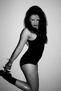
The image of Lucy that we decided to use on our tour poster is very striking. Lucy isn’t looking at the camera, instead she is looking downwards. This could show that she is a mysterious artist who wishes to hide her identity; this will draw the audience into wanting to watch her but could also show her vulnerability and femininity. I also think that this will attract both a male and female audience as Lucy is wearing a leotard and is showing a lot of skin, this I feel breaks the codes and conventions of an acoustic tour poster. As unlike Regina Spektor’s we have decided to use quite a seductive image of our artist instead of using a cartoon or image to represent her. I feel this works better as it widens our target audience and also makes our tour poster look more attractive and by using an image of her our audience will be able to recognise her straight away.  

When researching popular venues for acoustic artist to perform these were what we found. We feel that we have picked the best suited for our artist and have created a believable tour poster for our genre of music. I love the contrast of red and black on our tour poster because in my opinion the colour red suggests passion, love and femininity and the colour black is a powerful, dominant and masculine colour which will help our artist appeal to everyone.

Final product

are you satisfied?
Overall I am extremely satisfied with what my group has produced, i believe we have created a music video that is parallel to the conventions of any music video in a modern society. From the beginning we aimed to produce a video that would contain a narrative and a performance and when watching our music video back we think this is the best decision we made. I think we have made a clear narrative that our target audience can relate, this has been done through the development of characterization of the two lovers. I feel that by having believe able actors in the videos who could express emotions clearly we were able to represent the themes of love, loss and hope very well.
I think that my group in the end worked very hard as a team in order to finish the project and have overcome many obstacles that hindered our progress, but our high spirits and motivation helped us strive for success.

what would you change?
When researching for our music video we created a storyboard in which my group worked together to carefully plan each shot, however when starting to film we rarely looked at it and this is where i strongly believe our project began to fall apart. Furthermore, this lead to my group not entirely knowing what to film which meant it took longer then planned to get the shots that we wanted. We eventually went back to our storyboard and everything started to become easier and we finally decided to stick to our original ideas. If we had stuck to this is the first place i believe we wouldn't have wasted as much time as we did trying to rethink ideas.
If i could start this project again i would also choose an artist (Lucy) in which was more accessible, I've found it extremely difficult getting in contact with Lucy. Originally we wanted to film her performing 'Bullet' and numerous times have turned up and the gig has been cancelled. This meant we had to think of new ideas that didn't involve Lucy actually being in the video... which lead to me miming the song. I also think that more contact with Lucy would have helped us with the meaning behind the song which would have been useful as we might have had more ideas with the narrative.
I also think that choosing a female character that was quite timid was a bad desicion in my group, as being infront of the camera requires confidence and without this it meant we wasted time trying to force perfect shots. If I had suggested that I should be the lead female then we would have finished the project alot quicker, resulting in more time for editing and perfecting my evaluation.

Editing

One of the main problems that i believe hindered our progression were the problems we were faced with when editing our music video. I took it upon myself at home to do the editing, the latops at college were extremley slow and we were unable to convert our video footage due to poor software. Whilst at home i downloaded 'Wondershare Video Converter' which was I found very useful but was slow to use and took over a day to process all of our footage from 'SANY' to 'MOV'. We also used a different editing software to the rest of the class due to using my laptop, we edited our video on 'Windows Live Movie Maker'. Even though this software limited the fancy editing we could do, I found it was useful for my group because it was simple and this went with the image we was trying to convey with out target audience.
When editing our video i decided to use a black and white filter over the perfomance shots in the video. This was done for a purpose, we wanted there to be a clear difference between the performance and the narrative. We wanted the contrast to be noticable to the audience. The performance was edited with a black and white filter to show how the female lovers world is no longer colourful and happy, instead it is endless days of black and white because she is no longer in love. I also heightened the brightness in many of the narrative shots because i wanted there to be emphasis on how bright and happy the female lovers memories were of her ex boyfriend.

Filming

When filming our music video we endured many problems that hindered our progression. When originally casting the two characters in our video we imagined that they would be flexible to film, however on many occasions the female who asked to star in our video failed to show up and this lead to many problems. These included difficulties such as an inability to keep up continuity, the first filming took place with snow in the background and before we had the chance to film again the snow had melted. As a group we managed to make a decision that I feel has dramatically improved our video which was for me to be the female character. This meant that filming was easy and accessible as I knew exactly what I wanted the character to bring to the narrative of the film and felt I had a greater understanding of the characterization of her. Also, because the male in the video is a close friend of mine we were able to create a relationship that was believable to the audience and captured the romanticism of the narrative. We also had to reshoot due to one of the members in my group mistakenly believing the camera was recording, this meant that we had to reschedule another day to film and delayed our video development. However, I do feel that this was a learning experience as from this mistake we was able to reshoot extremely quickly as in our minds we knew the exact shots we wanted and helped us focus on portraying the characters with believable, in depth thoughts.  

Wednesday, 12 January 2011

Updates and new decisions

The location for our music video is extremely rural. We wanted it to be deserted and isolated to emphasize the pure love of the young lovers. The two people used in our video were able to portray the theme of true love excellently, we thought it would be very forced but the chemistry on set was just what we wanted to capture. Even though creating our video to the highest quality possible it has been hard for all of the group to be present on every occasion of filming. With two of the group having job commitments it has hindered our progress slightly. Another variable that has been hard for continuity has been the snow. We thought having the snow in our background looked beautiful, however it has been hard to film shots as the snow has been melting fast however so far we have six minutes of footage. Our teacher said that after looking at our rough shots that our framing and camera movements and angle are really good, and the are some very beautiful shots. He said that our storyline to the music video is clear. Even though there is not much more left to film, there are some crucial shots to represent the love between them. Shots such as close ups of them holding hands and of the couple looking happy together. We want to show the nostalgic memories of the couple, so it will make the individual shots of them even more heart braking.